
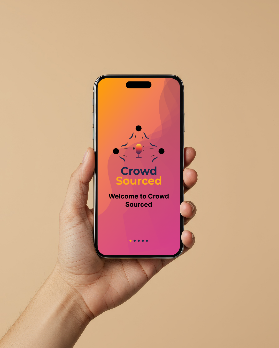
CrowdSourced
I created a mobile app project originally called “CrowdSourced CC Translation”, but later to rename it “CrowdSourced”. It is a mobile app that helps deaf and hearing individuals communicate in real-time through voice-to-text translation and captions. Below is my design process, including the sitemap, wireframes, low/high-fidelity UI design, and final prototype. This is one the most important I’ve completed and I’m proud to have created this project and independently completed all of its.
Problem
People need real-time communication between deaf and hearing users
Solution
Designed a mobile app with live captions
Tools
Figma, wireframes, prototype
Outcome
Improved accessibility and communication
Research/Analysis → Planning → Ideation Wireframes (Low + High Fidelity) → Testing → Final Design
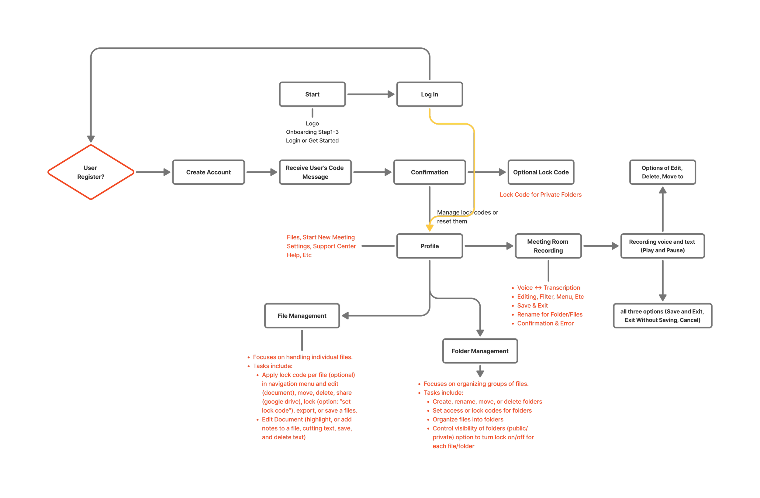
App Information architecture & User Flow
This project was created to organize and visualize app’s information architecture. The diagram illustrates how users navigate through the crowd-sourced from login to recording, managing, and exporting translated meetings.
It outlines a step-by-step workflow that supports smooth navigation across core features such as Login Account, Profile Management, Meeting Room (voice translation), Folder/File Management, and upgrade options.
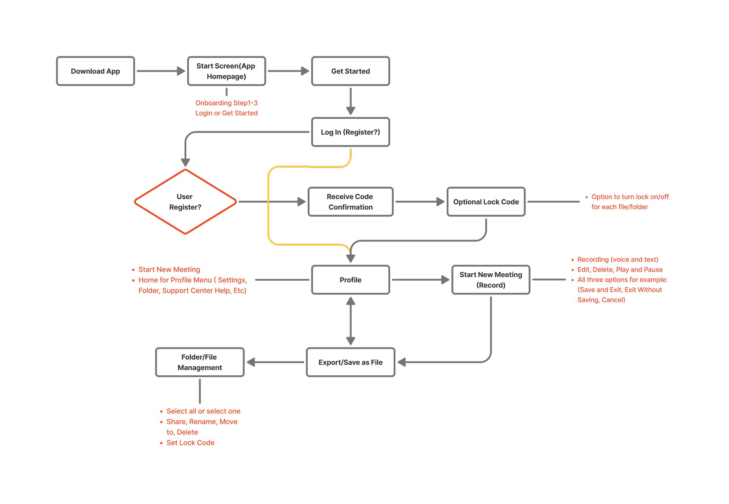
Low-Fidelity wireflow/Wireframe
Goal: Define navigation structure and key decision points before moving into high-fidelity design. to this wireflow map the user journey across sections like onboarding, home/profile, translation, etc.
Focus: accessibility, caption translation, file organization, and clear onboarding flow

High-Fidelity Wireframe
This flow illustrates the complete user journey of the Crowd-Sourced app from onboarding and login to recording, translating, and exporting meetings. It emphasizes intuitive navigation and accessibility for deaf and hearing users.
Click the image to view full size.
Prototype Wireframe
Designed, explored, created interactive app prototypes in Figma, applying a consistent design system to ensure accessible layouts, reusable components, and smooth user interactions.
The app includes a simple built in FAQ & Support section with answers to common tasks like resetting passwords, recovering files, managing lock codes, and updating recordings. All FAQs are organized on one support page. No extra wireframes needed. This keeps the app clear, accessible and easy to navigate.
Guidelines Design System and components
Practiced using design-system features, component design, and Auto Layout to create consistent, scalable UI. This helped me demonstrate strong visual design and system-thinking skills, ensuring all app screens stay clear, connected, and professional.
Navigation Components
Help users move through the interface smoothly by providing clear paths to important pages and actions. They improve usablility by making the layout predictable, consistent, and easy to explore.
Components
UI components are reusables building blocks such as buttons, cards, forms, and icons that ensure consistency across the design. They make the design system more efficient by allowing fast updates, better scalability, and a cleaner user experience.